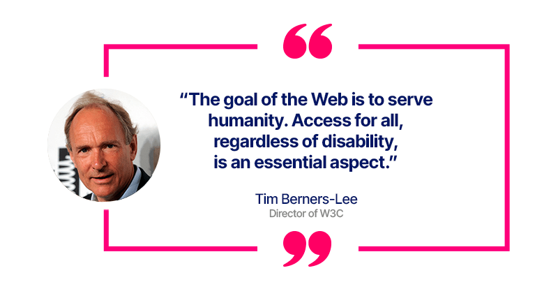
When we talk about accessibility, we tend to spontaneously associate this concept with the physical accessibility of a place. However, this notion also concerns access to information, particularly through the web, from which certain audiences can be excluded when a website or digital tools are not designed taking into account their potential difficulties.
In this article, we will explain in more detail the issues of accessibility on the Internet, and then we will indicate the key points to be vigilant about when you are designing a website or other digital tools. Ergonomics, design, navigation… Eminence advises you on the best practices to adopt to create a website that is accessible to all.
What does accessibility mean for a website?
Accessibility is a principle that aims to ensure that each one of us, including those suffering from disabilities, can use and navigate a website easily.
By disability, we consider auditory, cognitive, visual, or speech impairments, as well as neurological and physical disabilities.
The challenge for companies is therefore to ensure that their websites, tools, and technologies are designed and developed so that people with disabilities can understand, use, and interact with them.
Some statistics on disability around the world
The WHO estimates that 16% of the world’s population suffers from a disability, which is one in six people. A higher proportion is noted in developing countries, as their socio-economic situation and level of poverty directly impact the health of their inhabitants.
This represents one billion people, of which:
- 6% are affected by a hearing impairment
- 17% suffer from a visual impairment
- 2.3% are affected by an intellectual disability
- 1% need a wheelchair
The field of disability encompasses a wide range of disorders, whether they are sensory, cognitive, psychological, or chronic. In France, for example, one out of five people has a visible disability!
Did you know?
80% of types of disabilities occur between the ages of 18 and 64, that is, during the period when we are active workers.
The obstacles frequently encountered by people with disabilities
As long as we are not ourselves confronted with a disability or impairment, we often have difficulty imagining the reality on the ground.
Here are the main obstacles regularly encountered:
- Typography: too small, difficult to read
- Colors: lack of contrast, not easily perceptible for color-blind individuals
- Navigation: website structure that is difficult to understand, complex menus, complicated layouts
- Animations: annoying pop-ups, difficult closure (small cross), too many solicitations (for those with epilepsy)
- Language: poorly adapted, too technical vocabulary
- Content: too much text, absence of visuals to illustrate content (for dyslexics), inability to remove or limit multimedia content when needed

Tip: How to know if my site is accessible?
You can assess the accessibility of your website, its structure, and its content by testing it on various tools, to name just a few:
- Google Lighthouse: assigns a score following a detailed audit of a website’s accessibility and identifies all the issues encountered.
- aCe: quickly scans your website to assess its compliance by criteria.
- Wave: provides you with an instant visualization of possible areas of improvement on your pages: contrast, size, hierarchy, design, etc.
Why make a website accessible?
Even if the primary goal is to facilitate access to information for people with disabilities, accessibility can provide you with other advantages over your competitors.
A beneficial impact on all internet users
Although accessibility primarily targets people with disabilities, its implementation proves beneficial to other significant audiences, including:
- people using devices with small screens or different input modes, such as mobile phones, smartwatches, or connected TVs.
- older individuals, whose abilities change with age.
- people with a temporary disability, such as a broken arm or forgotten glasses.
- individuals in a location or situation that reduces viewing capabilities, like being in direct sunlight or in a place where they cannot listen to audio.
- people using a slow internet connection or having limited or expensive bandwidth.
Advantages for the company’s brand image.
Showing that you care about these issues can only be positive for your image among your target audience. By designing a site that is easy to understand in its navigation, interface, and content, you can attract and retain many users.
Disabled individuals who have a positive experience with your company will also be more likely to recommend you to their relatives and their communities on social media.
Accessibility can enhance your brand, foster innovation, and allow you to stand out from your competitors.
A significant interest in terms of SEO and organic ranking
Search engines like Google favor sites that make an effort on accessibility, as this benefits the user experience.
Readability, reduced loading time, simple and smooth navigation, internal linking without broken links… all are points of attention that will impact visitor satisfaction, reduce bounce rate, and achieve a higher organic ranking.
Clear content well represented by a page title and a hierarchical structure linked to header tags will be favored by Google, as it will most likely match the search intent. Similarly, adding alternative text, anchor text, or video transcripts facilitates the understanding of your content for both internet users and search engines, and consequently, their indexing.
Did you know?
Accessibility is now mandatory in many countries to promote social inclusion, depending on the type of site, the size of the company, or the sector of activity: Europe, United States, Japan, Israel, Canada, India, etc.
How to make a website accessible?
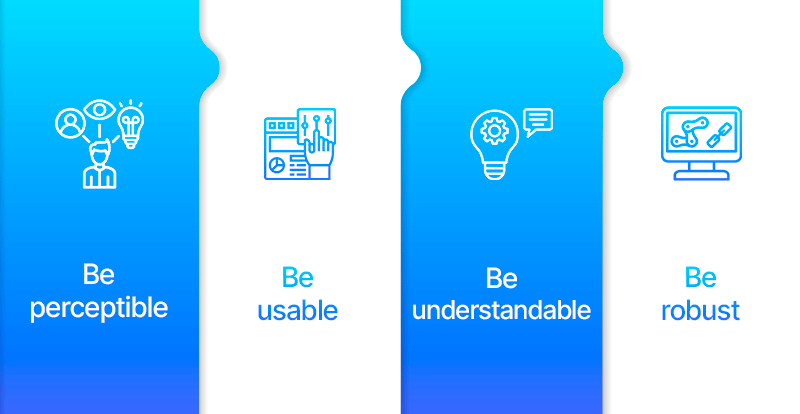
The 4 fundamental principles of web content accessibility:
- be perceivable,
- be operable,
- be understandable,
- be robust.

What are the practical key points to consider to make your site more accessible?
Principle 1. Be perceivable: the design
Colors: avoid overly aggressive colors or misleading combinations like those for color-blind individuals. Never use light gray color for text.
Contrast: use a contrasting color between the text and the background of your buttons, CTAs, links, etc. Make sure that the contrast between the background and text color is 4.5:1 (for small text) or 3:1 (for large text). Users must be able to visually differentiate links from the surrounding text.
Typography: prefer fonts that are easy to read, without confusing characters, with sufficient spacing between letters and a text size of 14-16px; the entire navigation link text should be 16-18px. You must offer readers the option to enlarge the font size.
Principle 2. Be operable: ergonomics and navigation
Navigation: logically structure the site’s hierarchy and your web pages to facilitate orientation. Enable navigation in various ways, without losing information or its structure. Always keep the breadcrumb trail aligned to the left.
Links: avoid using terms like “click here” and prefer text that defines the purpose of the link (anchor text). You must provide skip links to keyboard users so they can navigate directly to the main content. Alert users when a link takes them away from your site to avoid disorientation.
Principle 3. Be understandable: content and media
Page Structure: Choose a clear and relevant title for each web page, which will be your H1 tag and will help understand the topic of each page. Ensure to design a logical hierarchy by using descriptive headings for the content you will develop. Provide a clickable table of contents to facilitate information search.
Texts: Ensure your content is left-aligned, except for titles and subtitles (which can be centered or left-aligned), for reading comfort and for those with dyslexia. Enhance written content with graphics, images, and other illustrations with captions to aid understanding.
Images: Use Alt tags to clearly and concisely describe the image (alternative text) and ensure that image links describe the link destination. This is essential for people who use screen readers to assist with navigation.
Videos and Podcasts: Consider subtitling them, transcribing dialogues, narrations, and sounds. Users with hearing impairments must be able to pause, stop, or hide media content automatically.
Forms: Provide ample time for filling out and assistance for error correction.
Principle 4. Be robust: technicality
Design: Web pages must be designed to function predictably. They should be operable with the keyboard alone as some people cannot use a mouse.
Animations: Allow for the removal of distracting content, such as blinking or flashing, which is harmful to people with epilepsy. Avoid pop-ups, which are too intrusive and can be difficult to close.
Interesting features to offer:
- Add “Search” and “Help” functions.
- Offer spelling and grammar tools to facilitate writing.
- Allow a level of color customization to help better read content.
- Integrate a screen magnifier and/or text resizing tool to make reading easier.
- Provide text-to-speech software that helps users hear information without reading it, such as audio description, thanks to alternative text that screen readers read aloud, thus providing context for images to users.
- Optimize your content for voice search capabilities.
- Add buttons to enable forms on screen readers.
The W3C Standards: WCAG and WAI-ARIA
To ensure that your website is accessible to all your users, the World Wide Web Consortium (W3C) has issued a set of recommendations called WCAG, divided into three main categories: development, editorial, and design.
The criteria imposed by the web standardization body are considered the global standard for the design of accessible websites and media and cover the following 13 themes: images, frames, tables, colors, links, browsing, multimedia, scripts, required elements, presentation, navigation, forms, and structuring of information.
To go further:https://www.w3.org/TR/WCAG20/
WAI-ARIA (Accessible Rich Internet Applications) is a technical specification that provides a framework to improve the accessibility and interoperability of web content and applications. This document is primarily aimed at developers creating custom widgets and other web application components, such as using a site without a keyboard.
To go further:The basics of WAI-ARIA
Conclusion
Web accessibility is not just a legal requirement or a compliance exercise; it’s a commitment to inclusion that benefits all users. By adopting design and development practices that consider the diverse needs of users with disabilities, we can create digital experiences that are not only more accessible and inclusive but also more intuitive and enjoyable for a broader audience.
By integrating accessibility from the start of the design process, following WCAG guidelines, regularly testing accessibility, and listening to user feedback, we can ensure that our websites are open and usable by everyone, regardless of physical, sensory, or cognitive abilities.
Making the web accessible is a shared responsibility that enriches our digital space, and in this regard, Eminence can support you in creating or optimizing a website to make it more accessible to your various audiences.

